Select
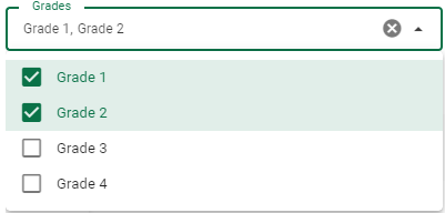
Lets you select a value or values from a selection list. Supports multiple selections and references. If no options are available, by default it can retrieve localized lists containing resources from src/I18n/locales/en.json.

<template>
    <v-row>
        <v-col lg="3" md="4" sm="6">
            <va-select-input label="Select" clearable multiple reference="employeegrades" v-model="model.grades">
            </va-select-input>
        </v-col>
    </v-row>
</template>
Local Enumeric Values
You can centralize all reuse options directly in your locale as described here. If no options are set, VaSelectInput will search for the following valid translated key format: resources.{resource}.enums.{source}.{value}
References
If you want to select from the current source reference, use the reference option as follows:
<template>
    <va-select-input
        source="companyId"
        model="companyId"
        reference="companies"
        :filter="{ active: true }"
    ></va-select-input>
</template>
The example above will fetch all companies from the api service and list them as options. For filtering, use the filter option. In case the schema name on the backend side is different from the source, you can use the model option. Otherwise, you do not need to use this option.
Interactive Select Fields
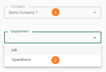
If you want to change another selection field interactively after selecting a selection field, take a look at the code in the example below.

<va-select-input
  source="companyId"
  v-model="model.companyId"
  reference="departments"
  variant="outlined"
></va-select-input>

<va-select-input
  source="departmentId"
  :key="model.companyId"
  :filter="{ companyId: model.companyId }"
  v-model="model.departmentId"
  reference="departments"
  variant="outlined"
></va-select-input>
Mixins
- Input
- InputWrapper
- Source
- Resource
- Multiple
- Editable
- Choices
- Search
Properties
| Property | Type | Description |
|---|---|---|
| source | string |
The property of the resource to fetch the value to display. Supports dot display for slot used object. |
| model | string |
By default source will be the last name sent to the API service for create/update. This support allows you to override this default behavior. |
| reference | string |
Name of the resource to search for. |
| variant | string |
Applies different styles to the component. (outlined, plain, underlined, solo, filled, solo-filled, solo-inverted). |
| multiple | boolean |
Activates multiple selection. |