AutoComplete
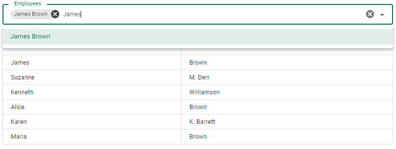
Allows selection of value or values from searchable options. Supports multiple selections and references. Allows searching for linked resources from your API service.

<template>
    <v-row>
        <v-col lg="3" md="4" sm="6">
            <template>
              <v-row>
                <v-col lg="3" md="4" sm="6">
                  <va-auto-complete-input density="compact" source="userId" resource="employees" reference="employees" variant="outlined" multiple chips>
                  </va-auto-complete-input>
                </v-col>
              </v-row>
            </template>
        </v-col>
    </v-row>
</template>
Chip Slot
You can customize the chip display using the chip slot.
<template>
    <v-row>
        <v-col lg="3" md="4" sm="6">
            <template>
              <v-row>
                <v-col lg="3" md="4" sm="6">
                  <va-auto-complete-input
                    density="compact"
                    source="userId"
                    resource="employees"
                    reference="employees"
                    variant="outlined"
                    multiple
                    chips
                  >
                      <template v-slot:chip="{ props, item }">
                        <v-chip v-if="item.raw.name"
                          class="cursor-pointer"
                          v-bind="props"
                          :text="item.raw.name"
                        >
                         {{ item.raw.name }}
                        </v-chip>
                      </template>
                  </va-auto-complete-input>
                </v-col>
              </v-row>
            </template>
        </v-col>
    </v-row>
</template>
Search Query and Min Characters
Use minChars and searchQuery to configure the minimum characters required before searching and the query search parameter key, which defaults to q. This element will reuse the GetList data provider method with a custom search filter.
For better performance, use the fields option to reduce API query overload.
Taggable
Autocomplete will be converted to a combo box component as soon as you enable taggable support. It allows you to create new tags instantly.
References
The SelectInput reference description for the auto complete is totaly valid.
Mixins
- Input
- InputWrapper
- Source
- Resource
- Multiple
- Choices
- Search
Properties
| Property | Type | Description |
|---|---|---|
| source | string |
The property of the resource to fetch the value to display. Supports dot display for slot used object. |
| model | string |
By default source will be the last name sent to the API service for create/update. This support allows you to override this default behavior. |
| variant | string |
Applies different styles to the component. (outlined, plain, underlined, solo, filled, solo-filled, solo-inverted). |
| reference | string |
Name of the resource to search for. |
| minChars | number |
Minimum characters that must be tapped before the search query is initiated. |
| searchQuery | string |
The name of the request query to search your API service. (Default: "q"). |
| taggable | boolean |
Enable taggable mode. Convert autocomplete to combo box. |
Slots
| Ad | Description |
|---|---|
| selection | Define a custom selection view. |
| item | Define a custom item view |