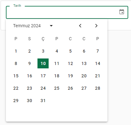
Date
It is used to edit the date type value. Vuetify consists of a read-only text field associated with the date picker. It does not support time value, in this case use classic VaTextInput.
<template>
 <v-row>
     <v-col lg="3" md="4" sm="6">
            <va-date-input source="publishDate" label="Publish Date" format="shortFormat"></va-date-input>
     </v-col>
 </v-row>
</template>
Mixins
- Input
- InputWrapper
- Source
- Resource
- Editable
Properties
| Property | Type | Description |
|---|---|---|
| source | string |
The property of the resource to fetch the value to display. Supports dot display for slot used object. |
| model | string |
By default source will be the last name sent to the API service for create/update. This support allows you to override this default behavior. |
| header | string |
Allows you to write text in the section shown under the title. The default value is empty. |
| format | string |
The date format to use. For example: (dd-mm-YYYY). |
| allowedDates | function, array |
Restricts which dates can be selected. |
| color | string |
Applies the specified color to the component - supports auxiliary colors (e.g. success or purple) or css color (e.g. success or purple) or css color (like #033 or rgba(255, 0, 0, 0.5)). Default value: primary. |
| elevation | string, number |
Specifies a height applied to the component, from 0 to 24. More information can be found on elevation. |
| hideHeader | boolean |
Completely hides the header section of the component. (Default: false). |
| height | string, number |
Sets the height of the component. |
| width | string, number |
Sets the width of the component. |
| max | string, number, date |
Maximum date/month allowed. (ISO 8601 format). |
| maxHeight | string, number |
Sets the maximum height of the component. |
| maxWidth | string, number |
Sets the maximum width of the component. |
| min | string, number, date |
Minimum date/month allowed (ISO 8601 format). |
| minHeight | string, number |
Sets the minimum height of the component. |
| minWidth | string, number |
Sets the minimum width of the component. |
| multiple | boolean |
Allow multiple date selections. |
| position | boolean |
Sets the position of the component (static, relative, fixed, absolute, sticky). |
| rounded | string, number, boolean |
Specifies the edge radius applied to the component. |
| showAdjacentMonths | boolean |
Toggles the visibility of previous and next months' days. |
| showWeek | boolean |
Toggles the visibility of week numbers in the body of the calendar. |
| hideActions | boolean |
Hides select actions. |
| hideWeekdays | boolean |
Hides weekdays. |
| inputPlaceholder | string |
Sets the placeholder value for the entry. |
| variant | string |
Applies different styles to the component. (outlined, plain, underlined, solo, filled, solo-filled, solo-inverted). |
| viewMode | string |
Switches between month or year view (month, year). |
| disabled | boolean |
Removes the ability to click on the component. |