Data Table Server
VaDataTableServer is used for pagination of a list that fits the grid structure and for browsing and listing any resources. It includes features such as sorting, search, pagination, filtering and selection. The list layout in the default slot is fully customizable.
Mixins
- Resource
- Search
Options
| Property | Type | Description | Default |
|---|---|---|---|
| class | String |
It assigns a value to the HTML class attribute of the div element surrounding the data table. | va-data-table |
| density | String |
Vuetify allows you to select the original density property. Possible values: default, comfortable, and compact. | compact |
| rowClick | String, Boolean |
Makes each row clickable. Use predefined function as edit or show. | null |
| rowCreate | boolean |
Makes the row creation button visible/invisible in an updatable data table list actions. | false |
| rowEdit | boolean |
Makes the row edit key visible/invisible in an updatable data table list actions. | false |
| rowSaveDialog | boolean |
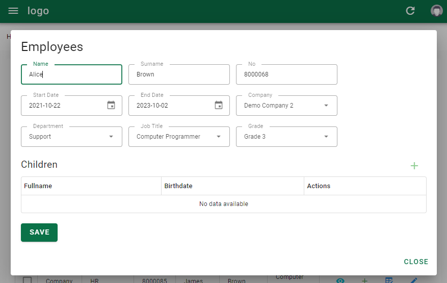
Makes visible/invisible the button that allows editing/creating a record in a data table list actions within a window. | false |
| rowSaveDialogWidth | boolean |
Sets the width of the window for the rowSaveDialog button. | 1024 |
| rowSaveDialogHeight | boolean |
Sets the height of the window for the rowSaveDialog button. | 600 |
| rowClone | boolean |
Makes the row copy button visible/invisible in an updatable data table list actions. | false |
| rowShow | boolean |
Makes the button that opens the row detail window visible/invisible in an updatable data table list actions. | false |
| showExpand | boolean |
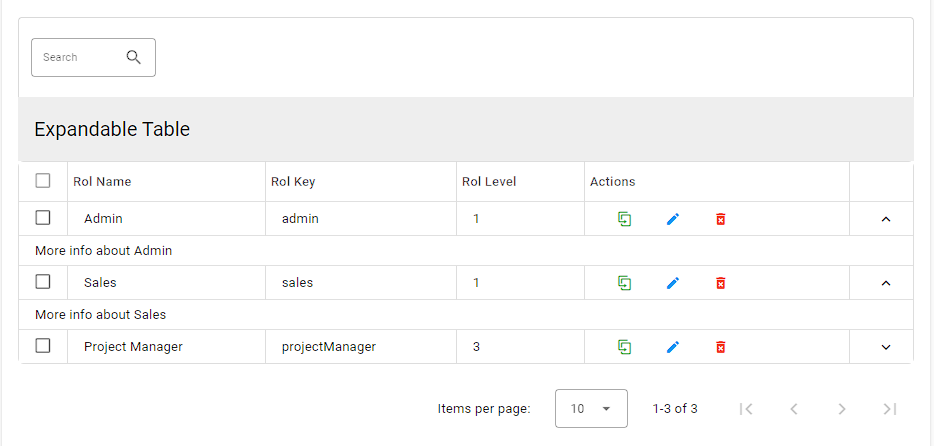
Enables line expansion mode for quick detailed view. | false |
| expandOnClick | boolean |
Allows the row to be expanded when the table rows are clicked. | false |
| groupBy | array |
Vuetify folders table data using the original groupBy function. It can take more than one value. | [] |
| visible | boolean |
Controls the visibility of the data table. | true |
| disableSelect | boolean |
Select all disables the selection list. | false |
| selectStrategy | boolean |
Defines the strategy for selecting items in the list. Possible values: single, page, all. | page |
| disableSort | boolean |
Disables the list sorting function. | false |
| disableShow | boolean |
Disables the button for the standard detail action. | false |
| disableEdit | boolean |
Disables the button for the standard record editing action. | false |
| disableClone | boolean |
Disables the button for the standard record copy action. | false |
| disableDelete | boolean |
Disables the button for the standard deregistration action. | false |
| disableCreateRedirect | boolean |
Disables the redirection process after the standard creation action. | false |
| disableShowRedirect | boolean |
Disables the redirect action after the standard detail action. | false |
| disableEditRedirect | boolean |
Disables the redirect action after the standard update action. | false |
| enableDeleteRedirect | boolean |
Enables the redirect action after the standard delete action. | false |
| multiSort | boolean |
Enables/disables the multisorting feature, which is enabled by default. | true |
| disableGenerateUid | boolean |
Disables Uid generation in an updatable data table list save action. | false |
| itemsPerPageOptions | array |
List of available item selections per page. | [5, 10, 15, 20, 25, 50, 100] |
Slots
| Ad | Açıklama |
|---|---|
| cell.actions | The data table allows new buttons to be added next to the buttons displayed in the standard actions section. |
| row.actions | It allows new buttons to be added next to the buttons displayed in the actions section in the updatable data table. |
| no-data | Allows you to customize the section displayed when no data is found. |
Events
| Name | Description |
|---|---|
| update:options | Triggered on pagination change. |
| update:filter | Triggered on filtering change. |
| selected | Triggered when the record is selected from the selection list. This event is recorded in array type. |
| item-action | Triggered on action on a specific row. This event will return a refreshed object from your API. |
| save | Triggered before the save phase in the updatable list. |
| saved | Triggered after saving in the updatable list. |
Columns
Use the fields attribute to define all columns. You need to at least set the source property that defines the source field you want to fetch, then the type of data formatter if it is different from simple text format. Check fields for all supported fields.
/olobase-demo-ui/src/resources/Employees/List.vue
<template>
  <va-list disable-create enable-save-dialog :filters="filters" :fields="fields" :items-per-page="10">
   <va-data-table-server row-show row-save-dialog row-save-dialog-width="1024" row-save-dialog-height="600" disable-clone disable-show>
   </va-data-table-server>
  </va-list>
</template>
<script>
import { required } from "@vuelidate/validators";
export default {
props: ["resource", "title"],
provide() {
return {
validations: {
form: {
companyId: {
required
},
employeeNumber: {
required
},
name: {
required
},
surname: {
required
},
}
},
errors: {
companyIdErrors: (v$) => {
const errors = [];
if (!v$['form'].companyId.$dirty) return errors;
v$['form'].companyId.required.$invalid &&
errors.push(this.$t("v.text.required"));
return errors;
},
employeeNumberErrors: (v$) => {
const errors = [];
if (!v$['form'].employeeNumber.$dirty) return errors;
v$['form'].employeeNumber.required.$invalid &&
errors.push(this.$t("v.text.required"));
return errors;
},
nameErrors: (v$) => {
const errors = [];
if (!v$['form'].name.$dirty) return errors;
v$['form'].name.required.$invalid &&
errors.push(this.$t("v.text.required"));
return errors;
},
surnameErrors: (v$) => {
const errors = [];
if (!v$['form'].surname.$dirty) return errors;
v$['form'].surname.required.$invalid &&
errors.push(this.$t("v.text.required"));
return errors;
}
}
};
},
data() {
return {
loading: false,
yearId: new Date().getFullYear(),
filters: [
{
source: "companyId",
type: "select",
attributes: {
optionText: "name",
multiple: true,
reference: "companies",
}
},
{
source: "jobTitleId",
type: "select",
attributes: {
optionText: "name",
multiple: true,
reference: "jobtitles",
}
},
{
source: "gradeId",
type: "select",
attributes: {
optionText: "name",
multiple: true,
reference: "employeegrades",
}
},
],
fields: [
{
source: "companyId",
type: "select",
attributes: {
reference: "companies",
},
sortable: true,
width: "10%"
},
{
source: "employeeNumber",
sortable: true,
width: "10%"
},
{
source: "name",
sortable: true,
width: "10%"
},
{
source: "surname",
sortable: true,
width: "10%"
},
{
source: "jobTitleId",
type: "select",
attributes: {
reference: "jobtitles",
},
sortable: true,
width: "20%"
},
{
source: "gradeId",
type: "select",
attributes: {
reference: "employeegrades",
},
sortable: true,
width: "10%"
},
],
};
}
};
</script>Field Attributes
| Property | Type | Description |
|---|---|---|
| source | string |
Key name of the resource to display. |
| type | string |
The field type to use. |
| label | string |
Column header title, use localized attribute source by default. |
| labelKey | string |
Overrides default source to i18n key message. |
| sortable | boolean |
Enables server-side sorting. |
| align | string |
You can use left, right, center for the align property of each cell. |
| link | string |
If you want to wrap the field inside the source action link, use any valid show or edit action. |
| input | string |
The input type to use for editable form rows. Overrides the default type. |
| attributes | object |
Any attributes or attributes that will be combined with the subdomain or input component. |
| editable | boolean |
Replace the field with the live edit input field. Ideal for fast live updates. |
Custom Row Actions
Row actions can be customized using the row.actions slot. In the following example, a special delete button in a data table belonging to software developers is directed to a route named delete-developer with the developerId parameter.

<template>
  <div>
    <va-list
      disable-settings
      hide-bulk-copy
      :filters="filters"
      :fields="fields"
      :items-per-page="50"
      >
        <va-data-table-server
          disable-show
          disable-clone
          disable-delete
        >
          <template v-slot:row.actions="{ item }">
            <va-action-button
              icon="mdi-delete-forever"
              :color="color || 'red'"
              text
              :to="{ name: 'delete-developer', params: { developerId: item.id  } }"
            ></va-action-button>
          </template>
        </va-data-table-server>
    </va-list>
  </div>
</template>
Field Templating
In case all the slot options above do not meet your needs, you can use the advanced slot templating for each slot. You can even use all the Olobase Admin fields in it. This is very useful when you need to place the field component inside the parent component as shown below:
<template>
  <va-list :fields="fields">
    <va-data-table-server>
      <template v-slot: value>
        <v-chip-group column>
          <va-reference-field reference="authors" v-for="(item, i) in value" :key="i" color="primary" small chip :item="item">
          </va-reference-field>
        </v-chip-group>
      </template>
    </va-data-table-server>
  </va-list>
</template>
<script>
export default {
props: ["resource", "title"],
data() {
return {
fields: [
//...
"authors",
//...
],
//...
};
},
//...
};
</script>To do this, simply use a slot called field.{source}; where source is the name of the field. This slot will provide you with the full row source element and the value of the cell to render by default.
Another example:

<template>
  <va-list :fields="fields">
    <va-data-table-server>
      <template v-slot: item>
        <v-chip label :color="getOrderStatusColor(item.orderStatusId)">
          <v-icon icon="mdi-label" start></v-icon>
          {{ $t("resources.orders.chips." + item.orderStatusId) }}
        </v-chip>
      </template>
    </va-data-table-server>
  </va-list>
</template>
<script>
export default {
props: ["resource", "title"],
methods: {
getOrderStatusColor(val) {
if (val == "waiting") {
return 'orange-darken-1';
}
if (val == "canceled") {
return 'red-darken-1';
}
if (val == "completed") {
return 'green-darken-1';
}
},
}
//...
};
</script>Expandable Row
You can use the extended element property with show-expand support for an additional full colspan cell below the element row. This method can be used when row data is long or for quick viewing.

<template>
  <va-list
   :filters="filters"
   :fields="fields"
   >
    <va-data-table-server
       disable-show
      :show-expand="true"
      :expand-on-click="true"
      :disable-actions="false"
    >
      <template v-slot:top>
        <v-toolbar flat>
          <v-toolbar-title>Expandable Table</v-toolbar-title>
        </v-toolbar>
      </template>
      <template v-slot:expanded-row="{ columns, item }">
        <tr>
          <td :colspan="columns.length">
            More info about {{ item.raw.roleName }}
          </td>
        </tr>
      </template>
    </va-data-table-server>
  </va-list>
</template>
Editable Rows
To create a data table with editable rows, you must use the following attributes in the VaDataTableServer component. When using these attributes, you must disable standard operations such as disable-edit, disable-show and disable-clone.
An editable table may include the following actions:
- row-create
- row-clone
- row-edit
- row-show
- row-delete

<template>
  <va-list
      disable-create
      :fields="fields"
      :items-per-page="50"
    >
      <va-data-table-server
        row-create
        row-clone
        row-edit
        disable-edit
        disable-show
        disable-clone
        disable-create-redirect
      >
      </va-data-table-server>
  </va-list>
</template>
Editable Interactive Rows
If you want to change another selection field interactively after selecting a selection field, take a look at the code in the example below.

<script>
export default {
  props: ["resource", "title"],
  data() {
    return {
      fields: [
        {
          source: "companyId",
          type: "select",
          attributes: {
            reference: "companies",
          },
          sortable: true,
          width: "15%"
        },
        {
          source: "departmentId",
          type: "select",
          attributes: {
            reference: "departments",
          },
          key: "companyId",
          filters: ["companyId"],
          sortable: true,
          width: "15%"
        },
      ],
    };
  }
};
</script>
You can find a more comprehensive example in the demo application in /resources/Employees/List.vue file.
Save in Dialog
If you want the update process to be done in a new window for each record listed in the data list, you should use the following attributes.

- rowSaveDialog
- rowSaveDialogWidth
- rowSaveDialogHeight

/olobase-demo-ui/src/resources/Employees/List.vue
<template>
  <va-list
    disable-create
    enable-save-dialog
   :filters="filters"
   :fields="fields"
   :items-per-page="10"
  >
   <va-data-table-server
     row-show
     row-save-dialog
     row-save-dialog-width="1024"
     row-save-dialog-height="600"
     disable-clone
     disable-show
   >
   </va-data-table-server>
  </va-list>
</template>