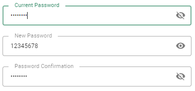
Password
Used for password fields. Show/hide behavior for current input.
<template>
 <v-row>
     <v-col lg="3" md="4" sm="6">
         <va-password-input label="Password" source="password"></va-password-input>
     </v-col>
 </v-row>
</template>
Mixins
- Input
- InputWrapper
- Source
- Resource
Properties
| Property | Type | Description |
|---|---|---|
| source | string |
The property of the resource to fetch the value to display. Supports dot display for slot used object. |
| model | string |
By default source will be the last name sent to the API service for create/update. This support allows you to override this default behavior. |
| variant | string |
Applies different styles to the component. (outlined, plain, underlined, solo, filled, solo-filled, solo-inverted). |